In the spirit of Ansel’s openness and willingness to share his approach and technique,here’s a look at how these prints were made when Ansel was alive, and how I make them today in my own darkroom in Santa Fe. Although there have been updates and improvements, the process is still basically the same as it was when Ansel launched the series in 1958!
Negatives: The Yosemite Special Edition prints are all made from Ansel’s original negatives, which are predominantly 8×10 format. The series also includes 5×7, 4×5, 31/4x41/4, and 120 square formats; one negative, “Bridalveil Fall”, is an 8×10 glass plate.
The negatives span a period of over 30 years, from 1927 to 1960, and were processed in many different developers. A number of them are “pre‑Zone System,” so there is some variation in contrast and density, and a few of the finest negatives sustained some damage during the 1937 fire in Ansel’s Yosemite darkroom. Despite these technical challenges, the strength of the images makes them completely “printable,” with no loss of quality or aesthetic.
Enlargers: Ansel worked with two enlargers. The 8×10 was completely custom, made from an old 11×14 studio camera by a well-known camera repairman in San Francisco; it rolled on tracks on the floor, horizontally projecting the image onto a large vertical easel that ran on the same tracks. The system was designed to facilitate the making of mural prints, but could also easily project smaller images when desired.
His other enlarger was a partially customized 4×5 Beseler MCRX, fitted with a custom-made variable-contrast cold-light head. In later years, we refitted it with an 8×10 adapter that I designed and ultimately patented.
Today, I use both a Beseler 810VXL enlarger with an Aristo T12 cold-light head and a V54 tube (using my original 8×10 adapter design), and an Omega D5500 fitted with an 8×10 adapter I made for that machine. I also use yellow and magenta, or blue and green, filters of varying strengths to achieve the desired contrast on variable-contrast paper.
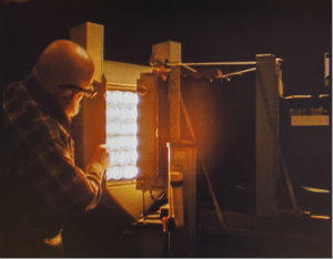
Light Source: Ansel used diffusion light sources exclusively for his work because they produce an image more in harmony with the inherent tonality of the negative than does a condenser‑type light source. Though he had a rather exotic set-up on the 8×10 in the ’60s and early ’70s (a square bank of 36 individually switched light bulbs behind the diffusing glass), he changed in 1976 to a custom cold light because it was about seven times more efficient than the light bulbs.
Timers: Among Ansel’s most interesting pieces of darkroom equipment were the enlarging timers…there weren’t any! Perhaps it’s because he was trained as a musician, but the only timer to be found for printing was a custom‑made electronic metronome set at one beat per second. Ansel counted beats to time the exposure, including any necessary dodging and burning. In other areas of the darkroom, there was digital read‑out equipment for development and process timing and measuring negative densities.
I confess to becoming addicted to Ansel’s method of timing, and I still use an electronic metronome to keep track of dodging and burning. I also have an electronic timer to accurately track my initial “basic” exposure because tenths of a second can make a huge difference, particularly with very short exposure times.
Exposure: Watching Ansel print was like watching a ballet. The dodging wand or burning card was always in fluid motion, with never a jerk or tense‑muscled quiver of the printing tool. Turning the enlarger on with a large card between the lens and paper, and with the metronome pulsing, he would swiftly remove the card (often with a flourish) and proceed to paint with light, as smoothly, surely, and delicately as if he could feel the photons passing through the air–the composer performing his score. An especially well‑felt exposure would often end with another flourish and a satisfied “Ahhh . . . ” He loved his work.
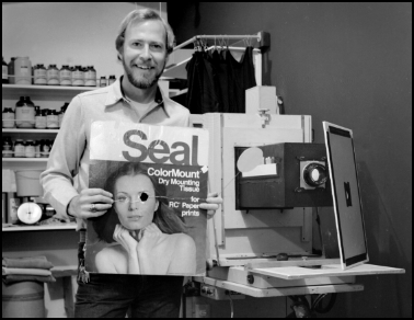
His printing tools, dodging wands and cards for burning-in, were homemade–the best and most useful ones usually are! They consisted of lengths of stiff wire with different size circles bent into each end, with the circles covered over with black tape, and a supply of mount board pieces (white on one side and black on the other) with holes of various sizes, shapes, and positions in them. One of Ansel’s favorite burning cards was the top of a Seal mount-tissue box, which carried the image of a beautiful woman–beautiful except for the fact that one of her eyes had been neatly cut out to create the burning hole!
Because successfully printing the SEPs to Ansel’s standards requires absolute consistency in tonality and quality, I’ve modified my printing techniques for them over the years. For a long time, I used the traditional dodging and burning tools favored by Ansel, but in the late 1980’s I started tinkering with a new approach that afforded me greater control. The result of that tinkering is a hands-free dodging and burning method called Selective Masking. By modifying the amount and kind of light that illuminates the negative, I create a “mask” that allows me virtually complete control of the tonal values in a print and ensures that each print comes out as intended.
Paper: Because the Special Edition prints were conceived as a series, Ansel wanted all the negatives printed on the same brand and type of paper so that surface quality, tonal rendition, and response to selenium toner would be as consistent as possible from image to image. According to Don Worth, the original series was contact‑printed on Kodak Medalist paper and developed in Ansco 130. Over the years, a variety of papers were used, from Dupont Varigam to Kodak Polycontrast to Ilford Ilfobrom, as technology changed and Ansel’s use of projection printing became the rule.
When Ilford introduced their Multigrade Fiber paper in the mid 1980s, we were finally able to settle upon a paper that met all of our criteria: it was consistent from batch to batch, always readily available in quantity, had a great tonal range and responded well to selenium toning. Ansel’s preference was always for unferrotyped fiber-base papers; resin-coated papers were never considered acceptable.
Developer: Nothing exotic was ever required or used. Ansel’s standard, Kodak Dektol, has served well over the years, but there are many other fine developers we employ from time to time, as well. When we were printing on graded papers and needed a between-grade contrast, we would use a mixture of Kodak Selectol-Soft developer, which reduces contrast by about a paper grade, with small amounts of Dektol stock solution added to build up the contrast slightly until we got the effect we wanted. With the advent of variable contrast papers, we have not needed to use a split-contrast formula.
Processing: The Special Edition prints are developed in batches of 15. We start with a tray of (for example) Dektol 1:4; a dilution that extends the average development time to about 3 minutes, giving a long enough immersion to keep the development uniform from sheet to sheet.
We agitate the stacks of prints in all solutions by hand. To begin the processing, the 15 dry, exposed prints are fanned face up in one hand like a large hand of playing cards. The free hand then quickly but carefully presses the prints one at a time into the solution face up. As soon as the last print is in the tray and the timer started, the print on the bottom is pulled out and placed face down on the stack, and so on until the whole stack is face down. The process is then repeated by taking prints from the bottom and placing them face up. This interleaving, or ”turning” process is continuous in all chemical baths, and with practice is very fast and yields highly uniform processing.
STOP-BATH: The stop bath is mixed by carefully adding a small amount of glacial acetic acid (99%) to a tray of water. Experience approximates the required 1% to 2% solution. Two complete rotations of the batch of prints in this bath is sufficient to neutralize the slight alkalinity of the developer. (As a reference, distilled white vinegar is 5% acetic acid.)
FIXING: We use a single bath of Ilford Rapid Fixer diluted 1:7 with water. This dilution allows the time to be extended to 2 minutes, important when batch processing. No “second” fix is necessary for archival processing since the rapid-fix gets the job done quickly. Other brands of rapid-fix, without a hardener added, would work as well.
RINSE: After the fixing bath, the prints are transferred to a tray of running water and turned at least twice before they are moved to a large holding sink where they are immersed in slowly running water. They are kept in this sink until the day’s printing is done, and then they are either toned or they are squeegeed back and front and placed on plastic screens to air-dry, awaiting toning at a later time.
TONING: Selenium toning does four things for an image: (1) it increases the permanence of properly processed black‑and-white silver emulsions, (2) it intensifies the blacks, (3) it enhances the print color on most papers, and (4) is a test for adequate fixation. Diluted Kodak Rapid Selenium toner will react with any unexposed silver left on the print; if the print DOES NOT stain in the toning bath, it means it has been adequately fixed.
My toning setup consists of three 11×14 trays, each containing a working solution of wash-aid. The middle tray also contains the toner. If prints have been dried before toning, I re-wet them in a tray of fresh water before starting the cycle. The wash-aid I have been using is Zonal Pro Archival Rinse. This seems recently to have been discontinued, but there are others which work well, including Orbit Bath or Perma-wash. Kodak Hypo Clearing Agent works well, but requires a longer wash time.
FINAL RINSE: The prints are rinsed after the toning process in exactly the same manner as after the fix: first in a tray of fresh water, then on to the holding sink. It is important that fresh-water rinsing trays and the holding sink be thoroughly drained and flushed with fresh water between the developing and toning processes.
WASHING: As has become painfully evident in recent years, an appropriate wash is critical to archival stability: not too much, not too little. A thorough rinse or two of the prints before they go into the washer is one of the best things that can be done to ensure permanence (assuming prints have been properly fixed and have been treated in a wash‑aid). We use a 16×20 Zone VI washer, which can wash 30 8×10 prints at once, and an 11×14 Cascade washer that can wash 32 8x10s. Most of the modern “archival” washers seem to work well, but avoid any system which allows prints to clump together. The prints are washed for about 30 minutes in water at a flow rate of about 4 to 6 liters per minute, depending on the washer. The prints are then removed from the washers, placed in a clean tray, drained, and squeegeed, first on the back, then on the front, and finally laid face down to air-dry on clean mesh drying screens.
FINISHING: After the prints have dried, they are sent off to a professional print retoucher to remove any dust specks in the image. The prints are then dry-mounted on bright-white, 4-ply buffered museum board. Heat activated mount tissue is first tacked to the back of the print, the print and tissue are trimmed together and then positioned and tacked to the mount. This assembly is placed between two sheets of four‑ply museum board and the whole ensemble is put in a dry-mounting press for 2‑3 minutes at about 102 degrees Celsius. The four‑ply sandwich serves as a sort of cushion for the print, and the long pressing time allows the heat to thoroughly diffuse through it. After mounting we overmat each print with another sheet of 4-ply museum board, hinged to the long edge of the mount. The prints are inspected one last time before being shipped to the Ansel Adams Gallery for sale.
To see the full selection of Ansel Adams’ Yosemite Special Edition Prints, please visit the Ansel Adams Gallery website.


